Reports have three dimensions that you can change. These are the content (the words, numbers, graphs and tables you use to convey your message), the structure (how you organise the information you want to communicate), and the style (how you set out your content on the page or screen so that they are easily readable and understandable).
Recently, I did a makeover of the monthly management report for a nonprofit organisation where I changed the content, structure and style.
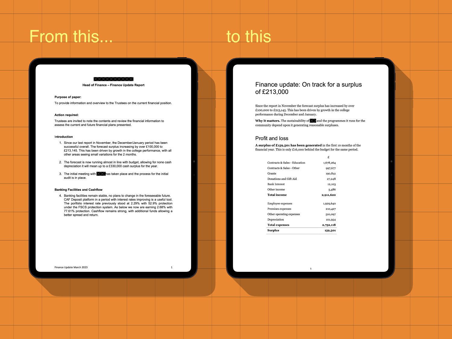
The content was all relevant for the audience (the nonprofit’s governing body) but was, in my view, more detailed than they needed. I think it also needed to be more insightful, telling them why something matters rather than setting out the financial facts.
The original report’s structure was okay, but it was not punchy. It was an organised list following, roughly, the chart of accounts codes. I changed the structure to make it clear, in the final section, what risks and issues the trustees should be aware of.
In terms of style, I changed the typography (influenced by Axios newsletters) so that the body text is in a legible, serif font and I increased the font size and margins to have a line length of 65 characters. This is much more comfortable to read.
I also included tables with minimal use of borders in order to make the numbers clearer to see.
I think the end result is much cleaner and easier to read. I reduced the report from over 1,400 words to fewer than 800, and the whole report was one page shorter. I also gave the report a title that is a headline for the whole report. The reader knows from the first 9 words they read what the key message is.
If you want to see the before and after versions of this report, click here.
And contact me if you would like me to makeover one of your reports.