Learn a few basic concepts of graphic design so that what you write is more readable.
This if the last of my five tips for writing about finance.
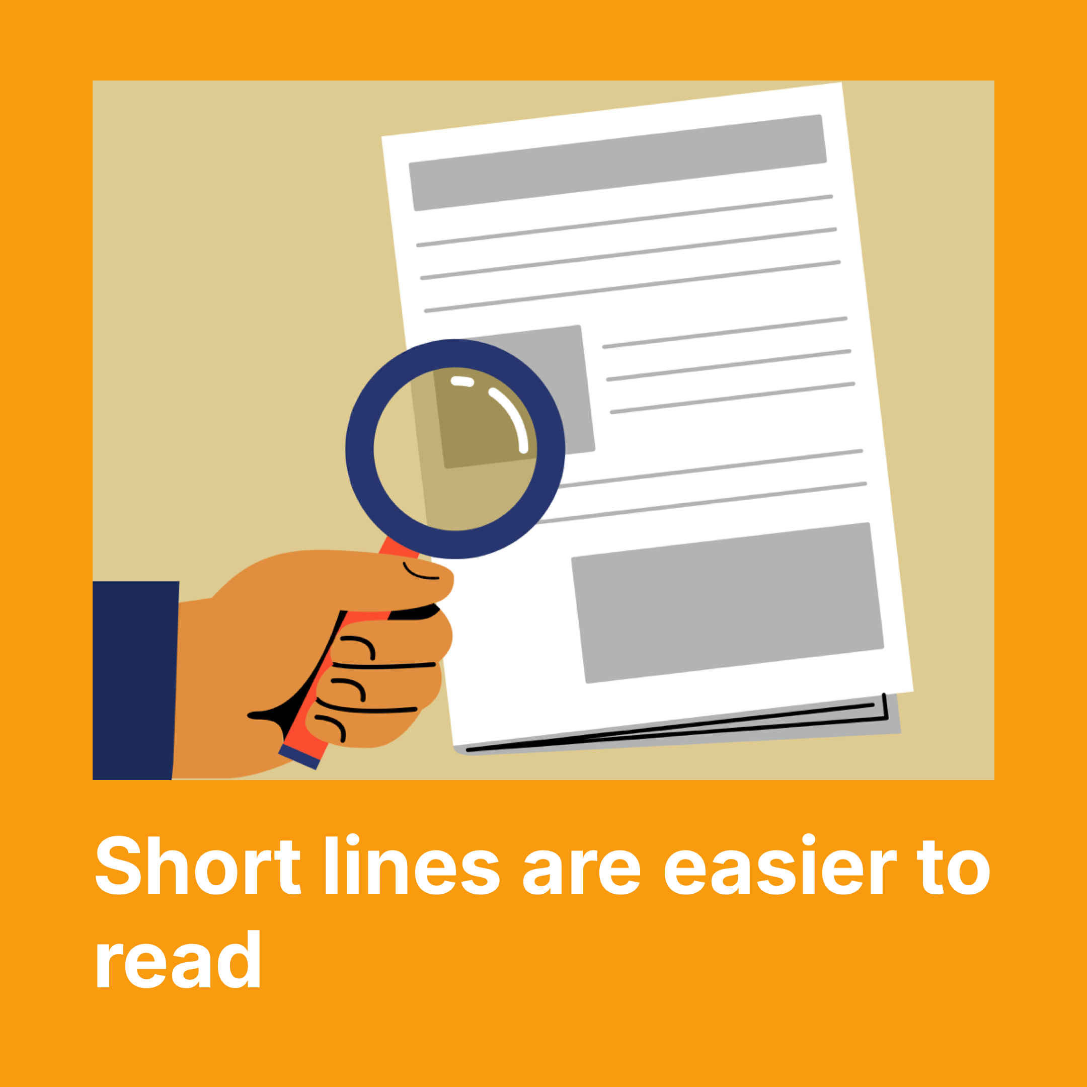
First, the optimum length of a line of type for readers is 65 to 75 characters. That is why newspapers and magazines are set out in columns.
Standard A4 paper with 2cm margins and a point size of 10 or 12 will have far too many characters per line.
Change the size of your font and the margins and instantly you’ve made your document more readable.
Second, think about the “white space” on your page: the margins, but also the space, or not, around tables and charts and headings.
Leaving space can make some elements clearer to readers. Look at articles in magazines and professionally typeset reports to see how they use white space.
