Have you ever struggled to read the serial number on a device because it is written in grey text on a slightly lighter grey background?
I wonder at the product designers who create these accessibility challenges. Surely they know better?
When it comes to your own presentations and documents you need to think about the contrast between text and its background.
There are various online services for checking the contrast between two colours. I like the one at Coolors. You’re looking for a ratio of at least 4.5:1.
Obviously you could use pure black and white with a ratio of 21:1 but you might find that the contrast is just a bit too harsh.
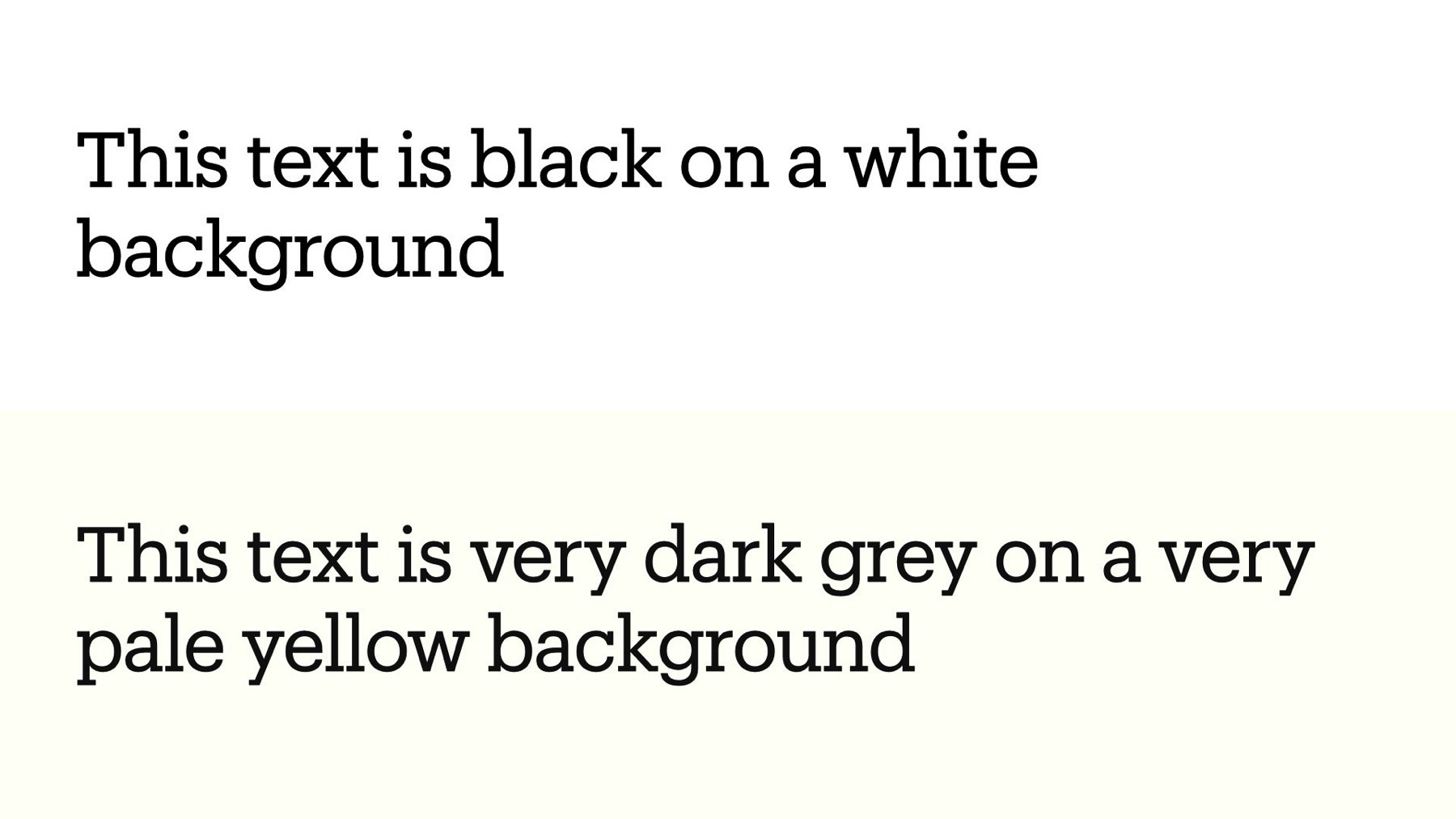
If the choice is yours you could change the theme of your slides or documents to use very dark grey (hex code #111111) instead of black (#000000), and very pale yellow (#fffff8) instead of white (#ffffff). This has a ratio of 18:1 and you can see it in my example below.
BONUS TIP
If you are presenting in a light space then use dark text on a light background. If the space is dark then reverse the colours (like dark mode on your phone). You might especially like pale yellow text on dark grey backgrounds when you are presenting in the dark.